


Project Summary:
I re-designed Bean & Pearl’s online menu and created extra branding collateral. This redesign focused on the typography of the menu and also making it more user friendly. Extra collateral was created to make a more cohesive brand.
I re-designed Bean & Pearl’s online menu and created extra branding collateral. This redesign focused on the typography of the menu and also making it more user friendly. Extra collateral was created to make a more cohesive brand.
Program(s) Used:
Adobe InDesign, Illustrator, and Photoshop
Adobe InDesign, Illustrator, and Photoshop
Type:
Typography and Branding
Typography and Branding
Process Work


This project started off as a menu re-design for a small business called Bean & Pearl; a bubble tea cafe! The reason I chose Bean & Pearl for this project was because the menu lacked certain typographic elements, such as proper hierarchy, font, weight, leading & tracking. While it was also not a proper menu, it lacked product descriptions and prices! The goal of this project was to enhance the design of the menu using typography.
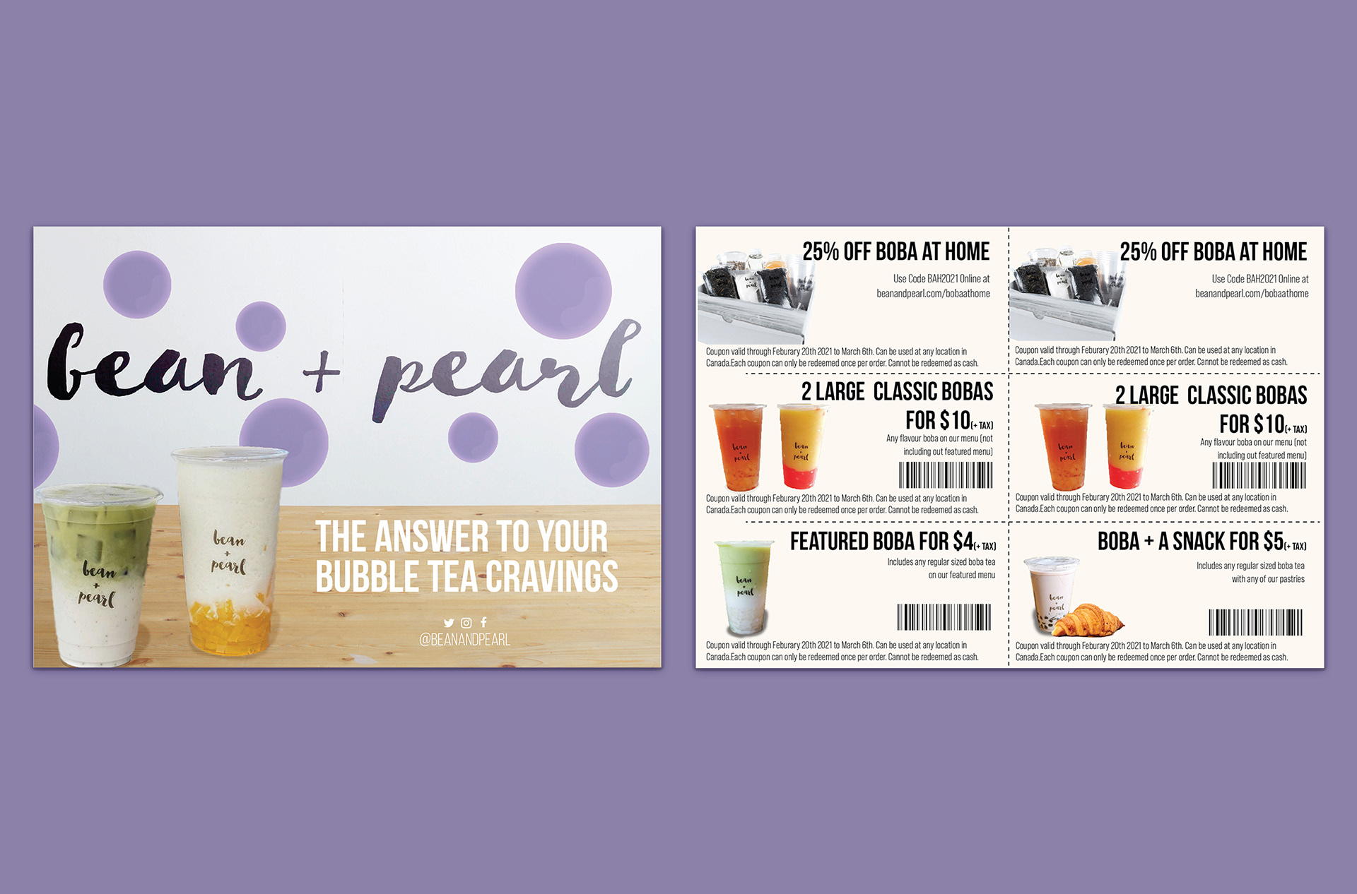
This project later turned into a branding redesign, as I thought adding on other branding and promotional material would help the consistency of the brand. I designed a letterhead and business card for them, and a coupon mailer.
As Bean & Pearl expands they’ve added a service called “Boba at Home” while they are closed because of Covid-19. I decided to take advantage of that idea and create some mailing packages and coupons for this limited product. I tried keep the style throughout all designs.