Project Summary:
This projects goal was to design a 36 page magazine from scratch. I designed a self-care magazine, that consisted of self-care tips, advice and articles.
This projects goal was to design a 36 page magazine from scratch. I designed a self-care magazine, that consisted of self-care tips, advice and articles.
Programs Used:
Adobe Illustrator, Adobe InDesign
Adobe Illustrator, Adobe InDesign
Type:
Editorial Design
Editorial Design
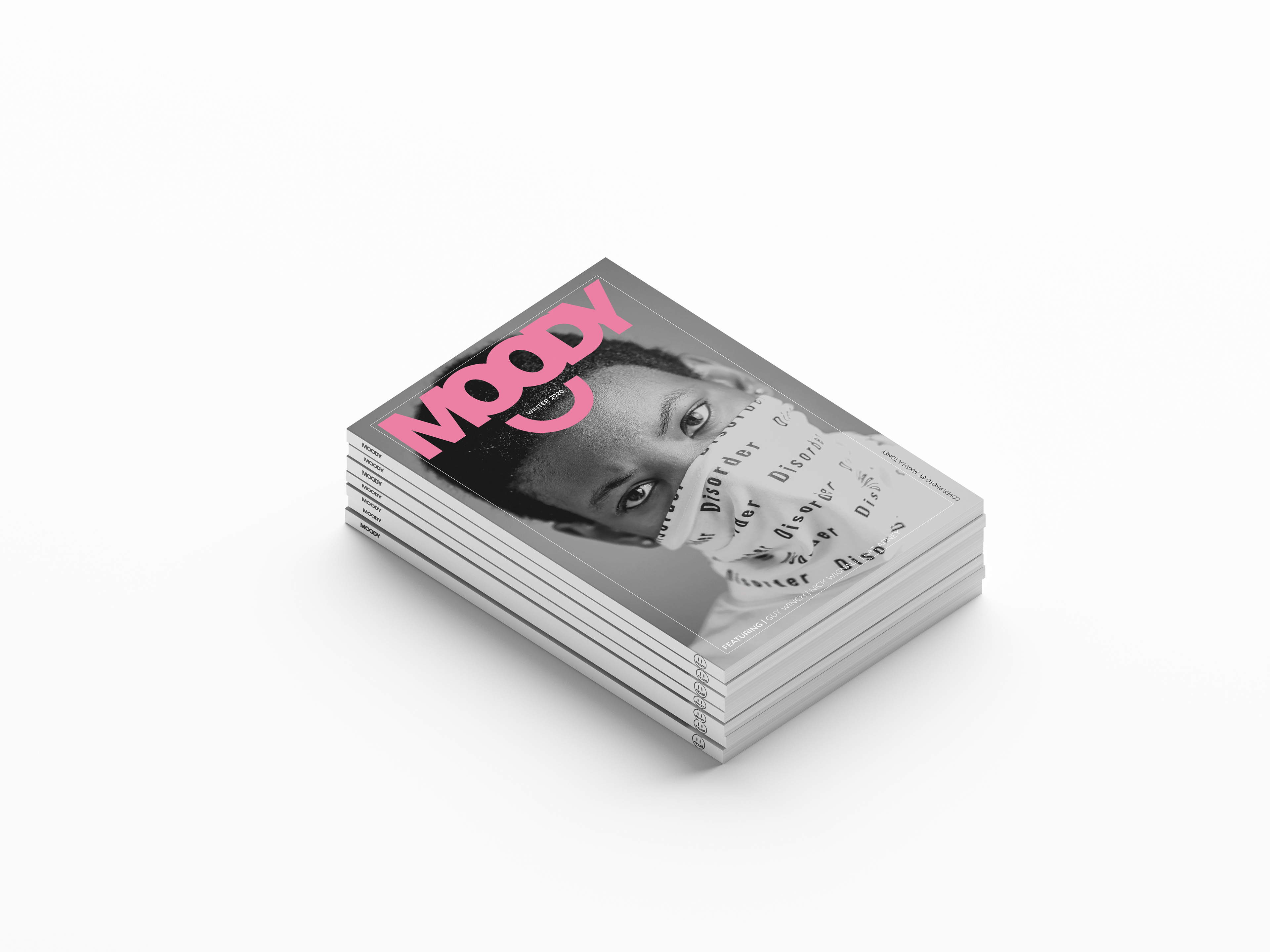
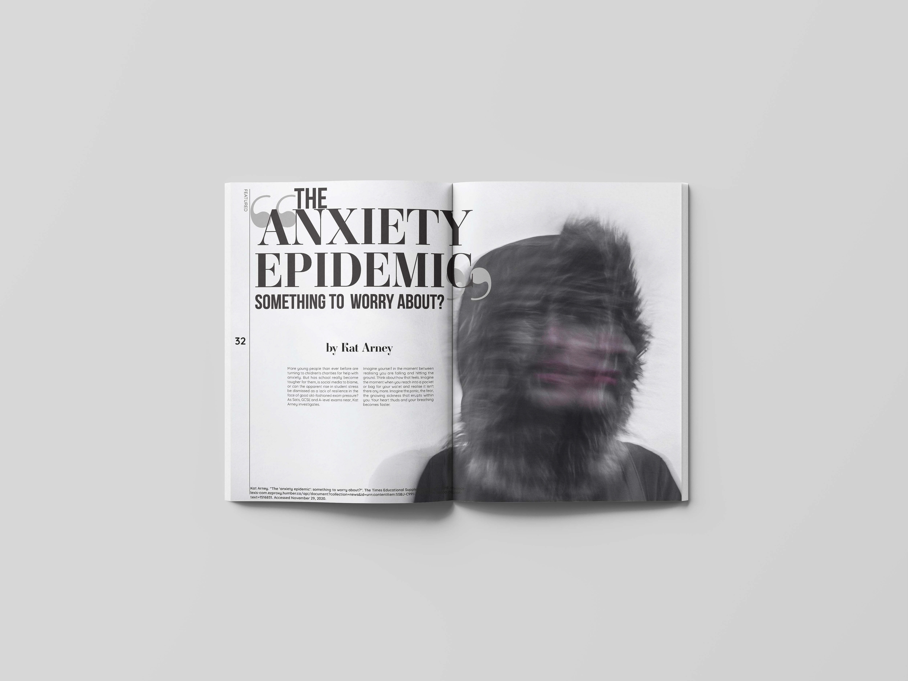
Final Magazine
PROCESS
Strategic Direction
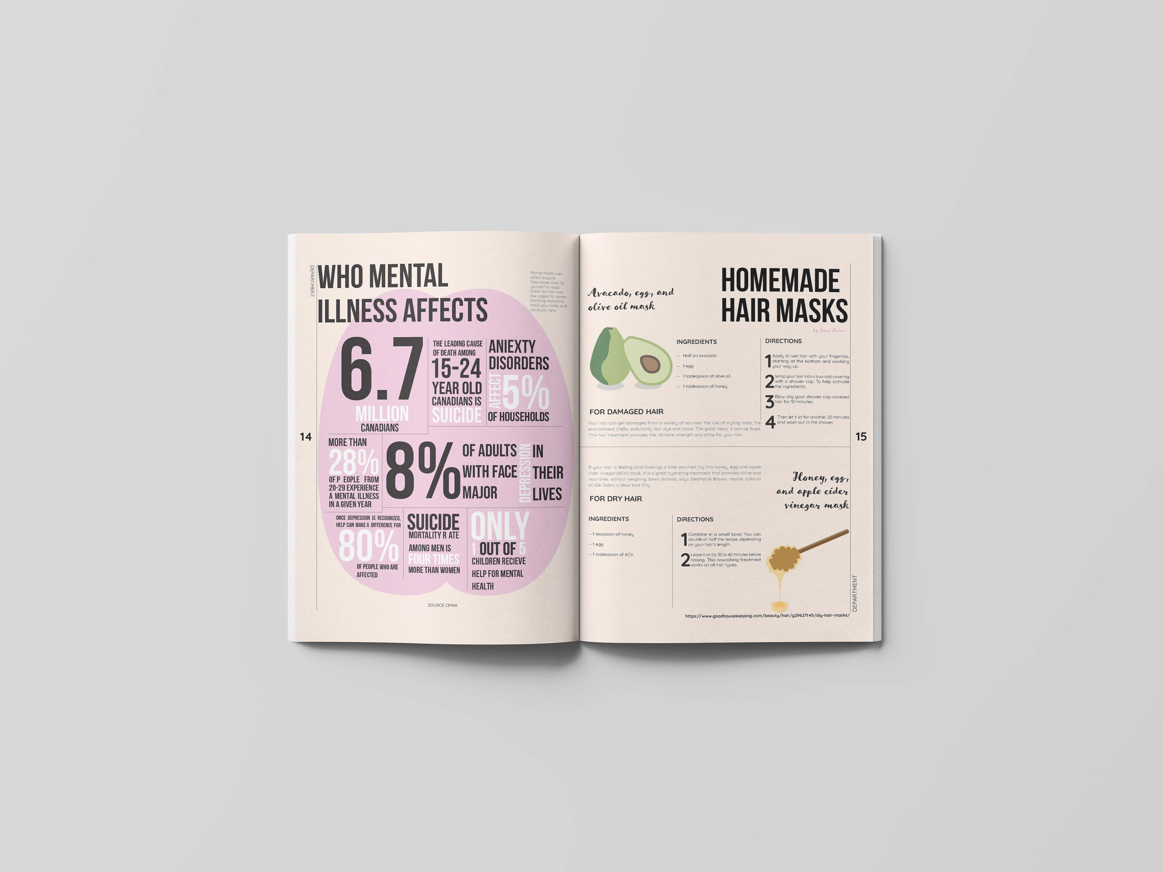
I wanted to created a publication that was about selfcare:
○ sleep, diet, mental health, hygiene
○ friendships/ relationships
○ fun tips and advice
What will it be called? Why?
Moody. I came up with the name Moody as a “play on words” with self-care focusing on caring for your emotions.
How often will you publish? Why?
Quarterly. Self care is something that can always be talked about, it can also follow through the seasons with new products and trends
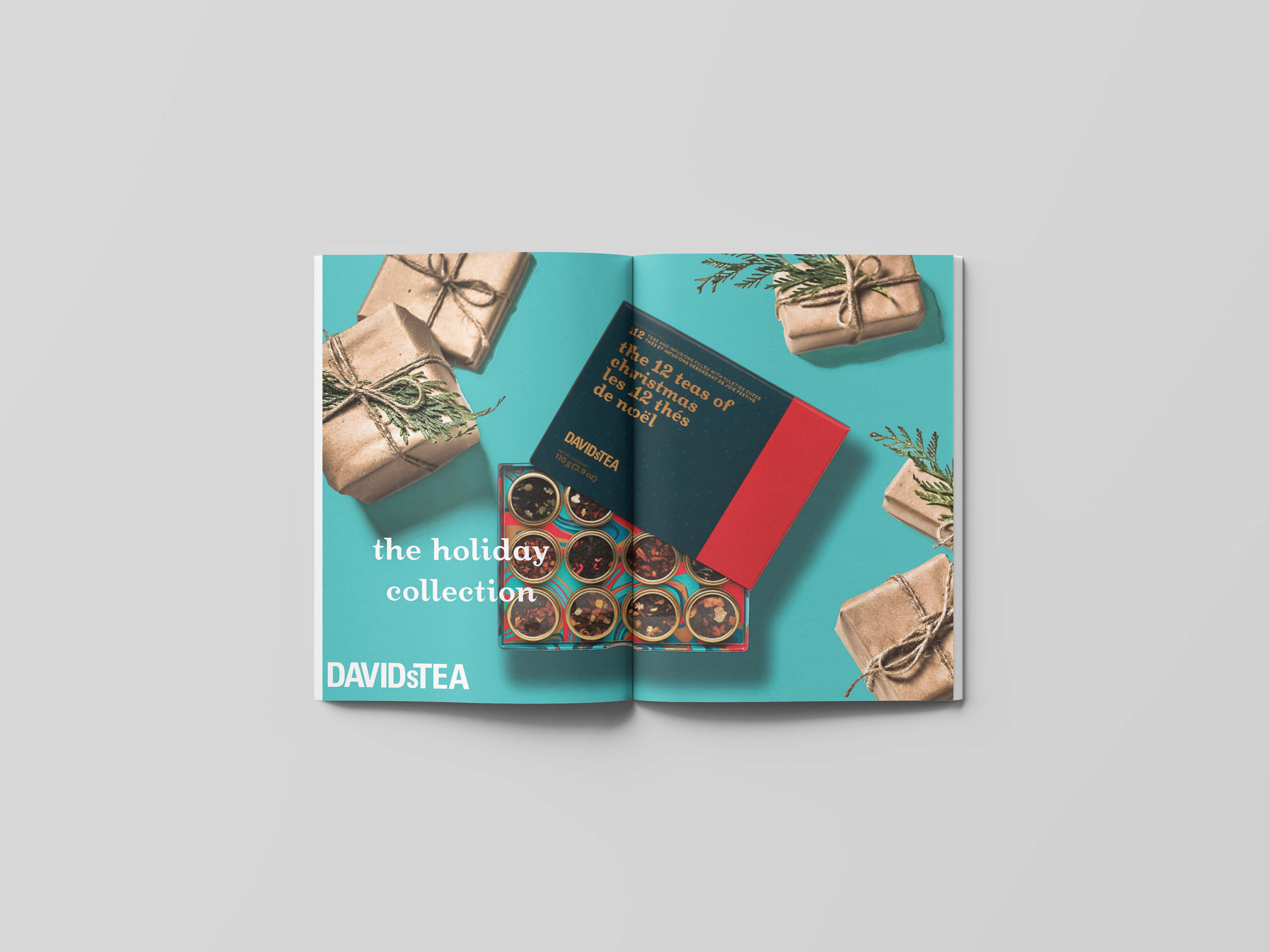
Will you have advertisers? Why or why not?
Yes, the self-care industry is starting to become larger and larger. There are many companies and products that influence self care and the lifestyle.
How will you be distributed? Why?
Distributed online. A younger audience will most likely prefer to order online and get it in the mail
How much does your magazine cost? Why?
around $15-20. Matte + thicker card stock paper for the cover, and normal glossy paper inside.
Who is your competition? How are you different?
Self care online blogs/ articles. Mainstream self-care magazines like psychology today (although i feel like these cater more to an older audience). The look of my magazine will stray away from the look of most magazines you see in store. More attention to detail printing wise.
Who is your audience? How old are they? How much money do they make? How educated are there? What are their interests? When do they buy this magazine? Why do they buy it? When do they read it? How long do they keep it?
Young adult Women. 18-25. Most of them would probably be making minimum wage, they’re in school still possibly or working part-time. Some could also be university/ college graduates. They’re interested in helping themselves, still in school or landing a first job or not knowing what they want to do in life. Looking for self-care tips and advice, they want something catered specifically for them, to have a sense of belonging and not feeling alone whenever they need help. Probably keep it for a couple of months, until they buy a new issue or need new reading material.
How will you talk to your audience? What will your tone of voice be?
Informal tone. Kind of how you would talk to friends or someone you’re comfortable with.
How will your design support that tone of voice?
Fun colours (bright or pastel). Tell it as it is images and headlines.
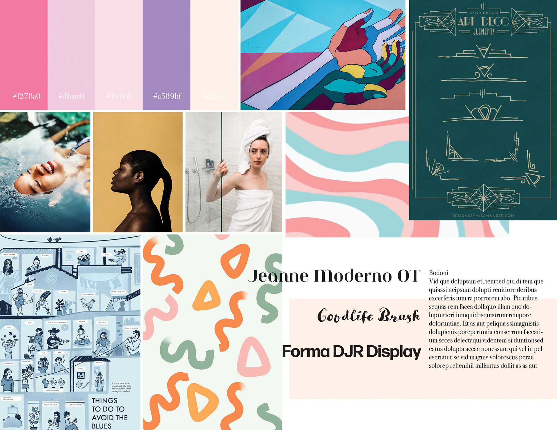
Moodboard
This moodboard is a visual description of how I thought I wanted the magazine to feel. The moodboard I created focuses on lots of fun colours and interesting images. there were a few changes made.
Font changes:
Jeanne Moderno < Ambroise STD
Forma DJR Display < Bebas Neue
Bodoni < Quicksand
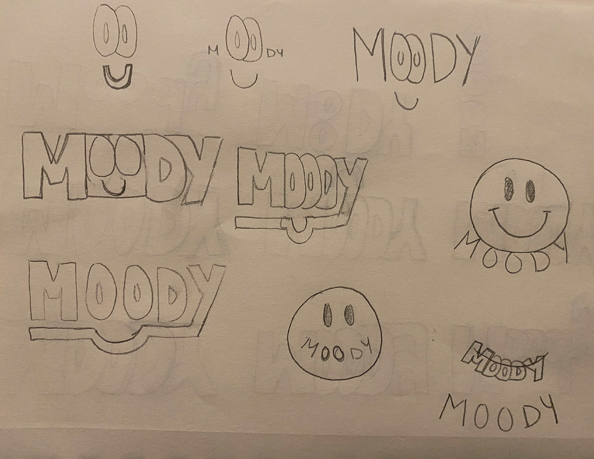
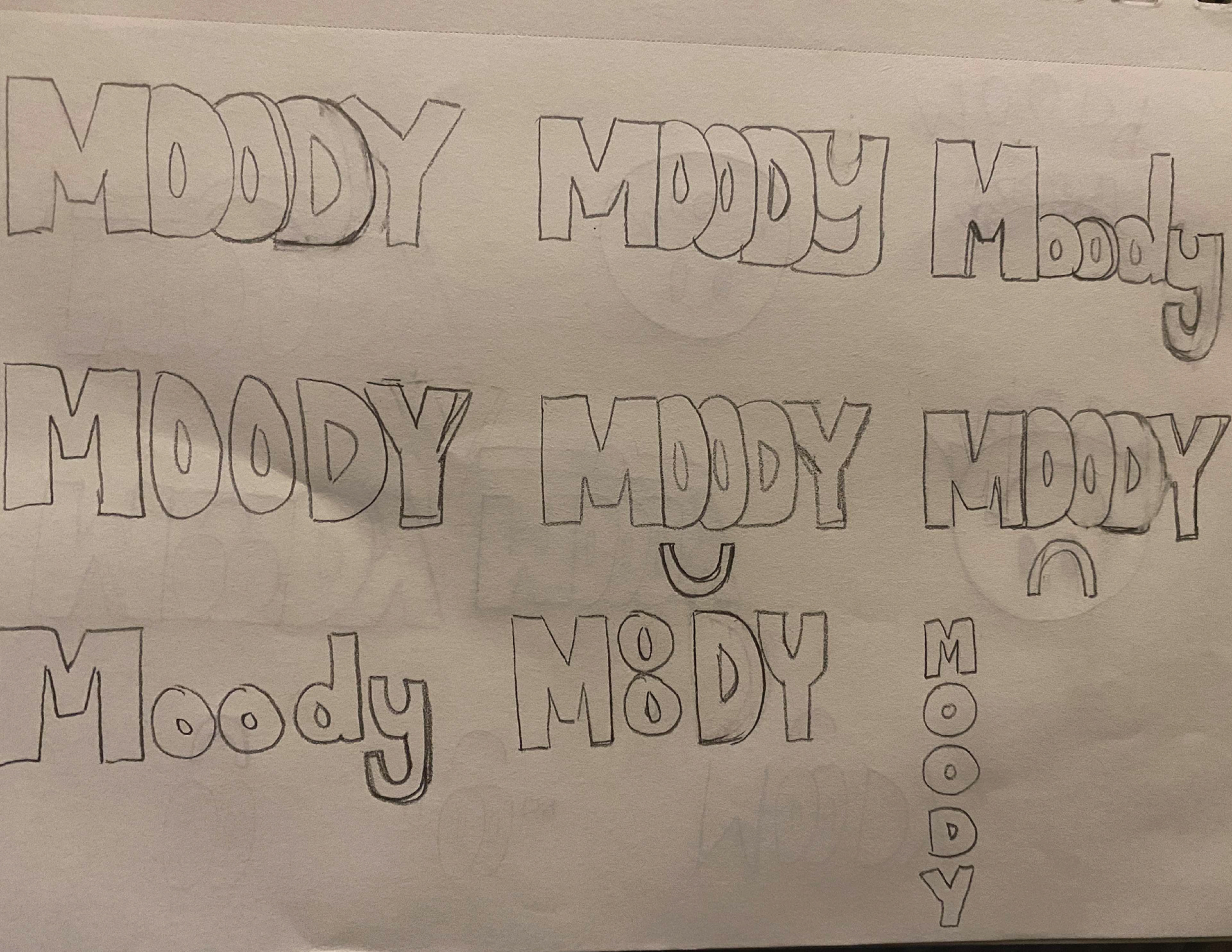
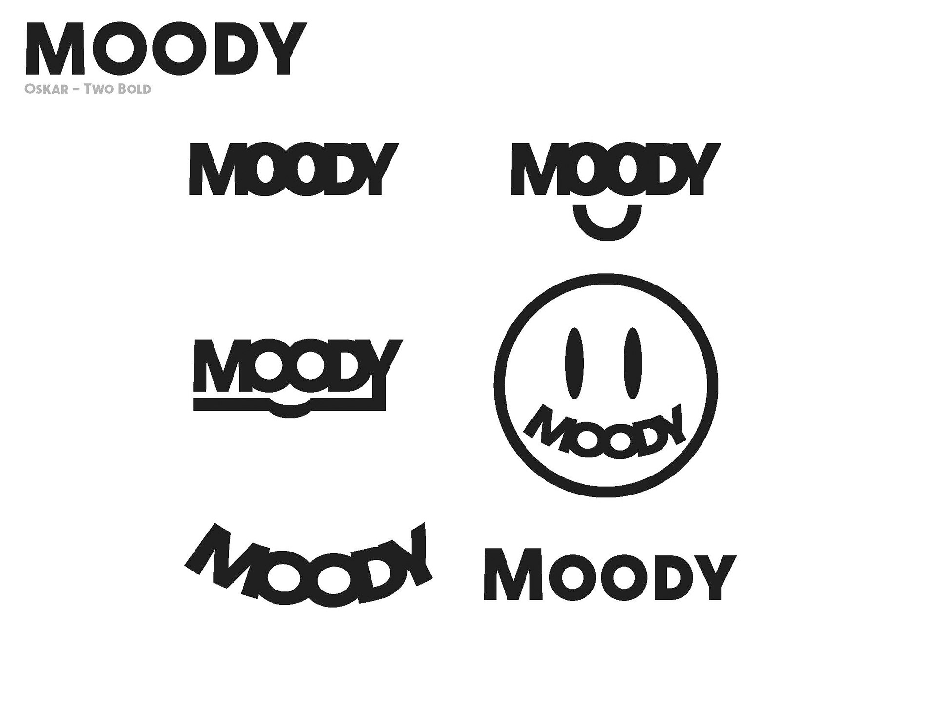
Logo Ideation
I wanted the logo to be bold and bubbly at the same time, this would allow the logo to stand out but also still be fun and welcoming.
Coming up with these logos I wanted to show how Moody was a magazine about selfcare. So a lot of my sketches tried to include a smiley face or the representation of a smile.
Coming up with these logos I wanted to show how Moody was a magazine about selfcare. So a lot of my sketches tried to include a smiley face or the representation of a smile.
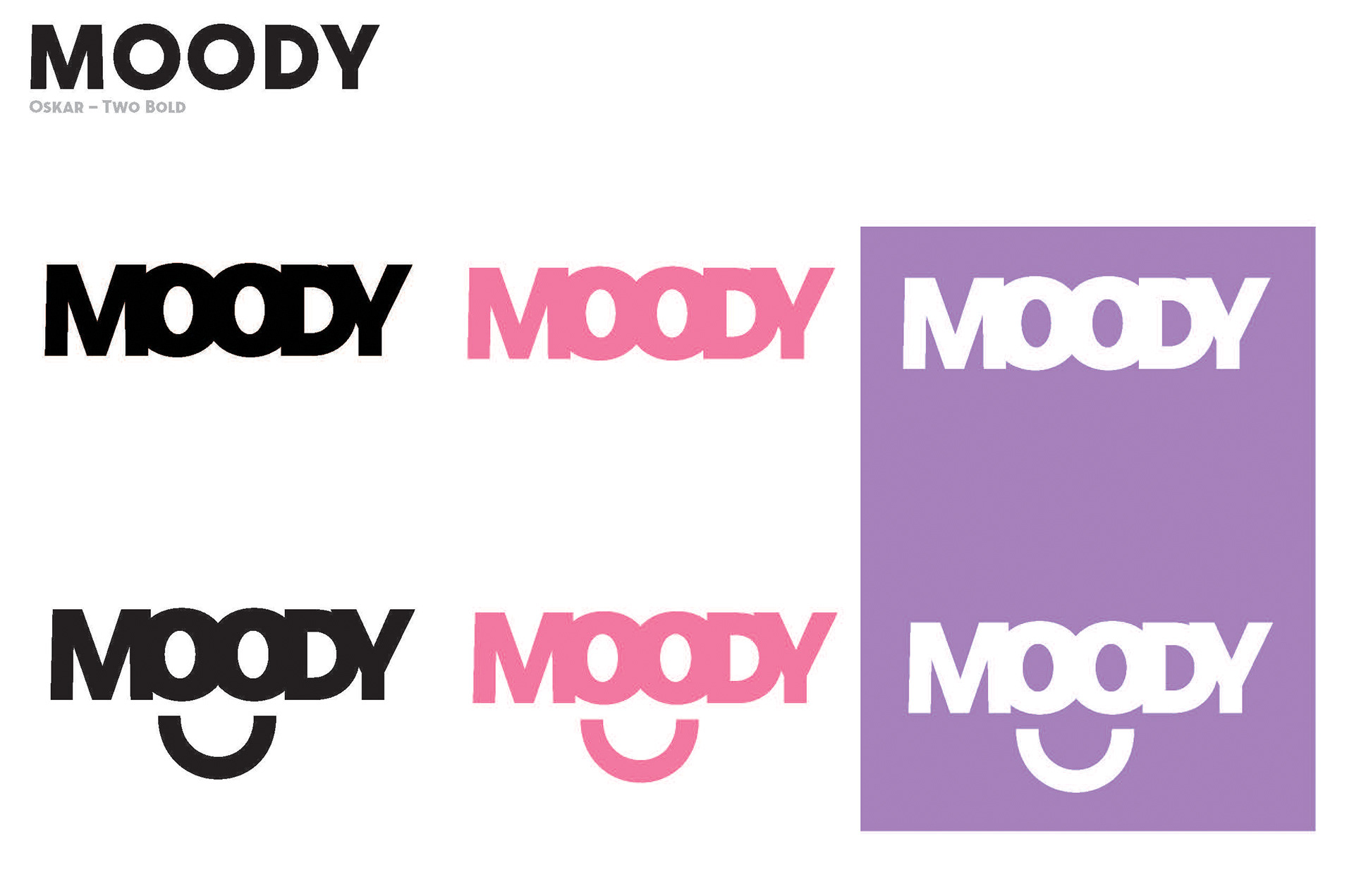
My final logo design used the font 'Oskar' in two bold. I chose this font because the letters were bold and had no contrast in the typeface. I thought this created the bold look I was going for without it coming off as harsh.
Design Guide Assets
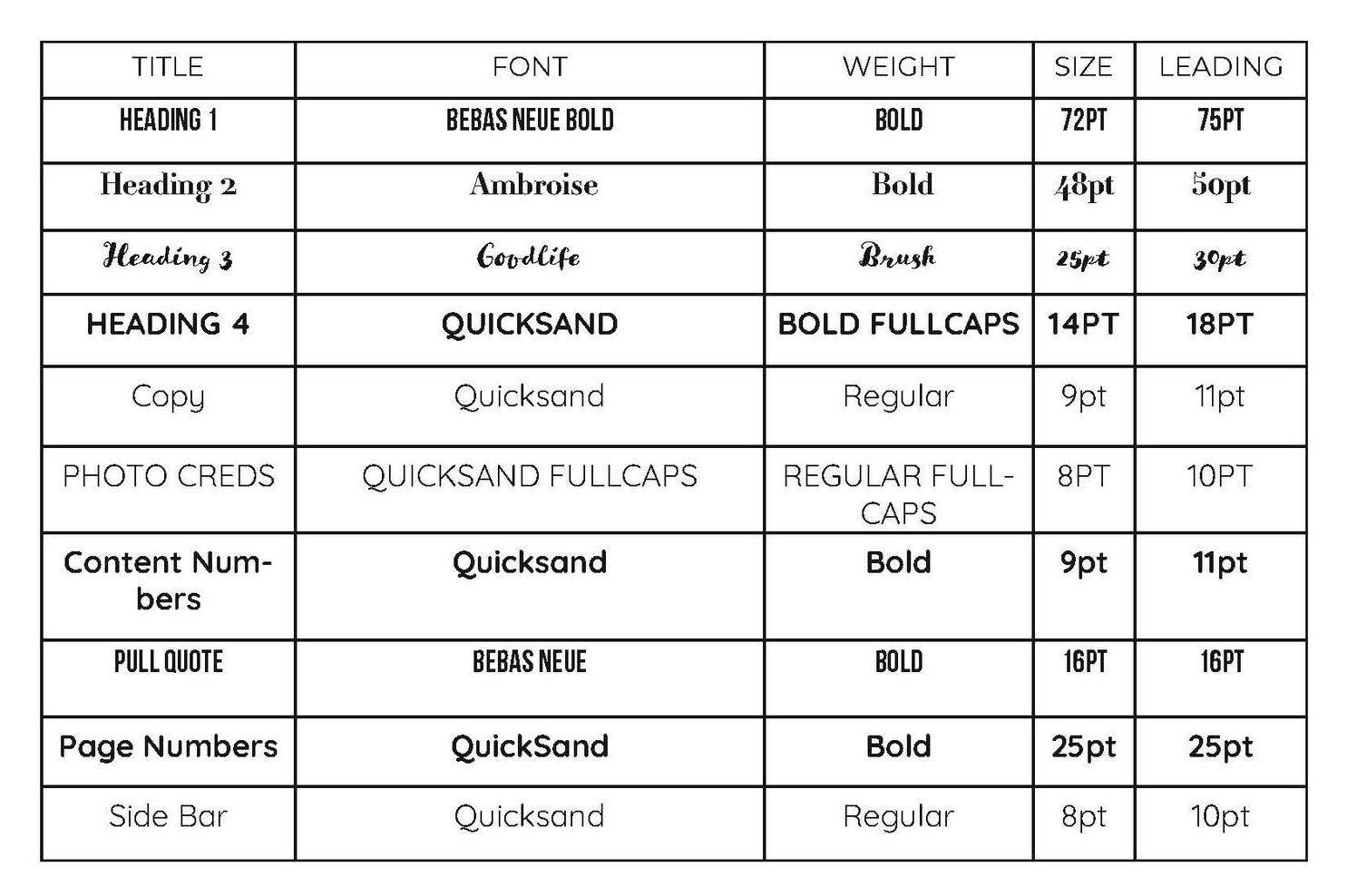
The paragraph style guide was created to plan out consistent fonts throughout the magazine but also helped to easily use these styles in InDesign using their paragraph style function.
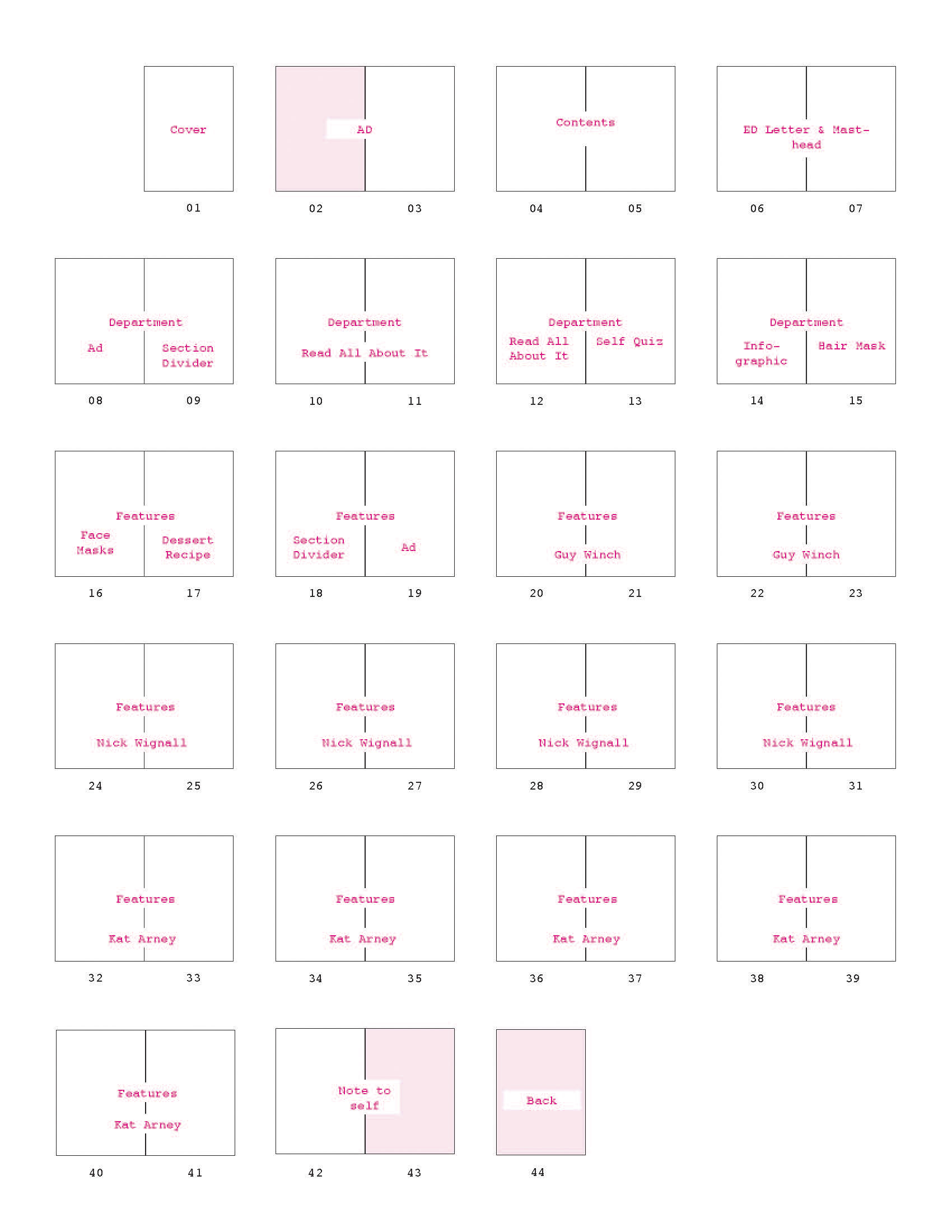
Then a flatpan was created to initially create the flow of the magazine and give me a rough draft of the layout of each page.
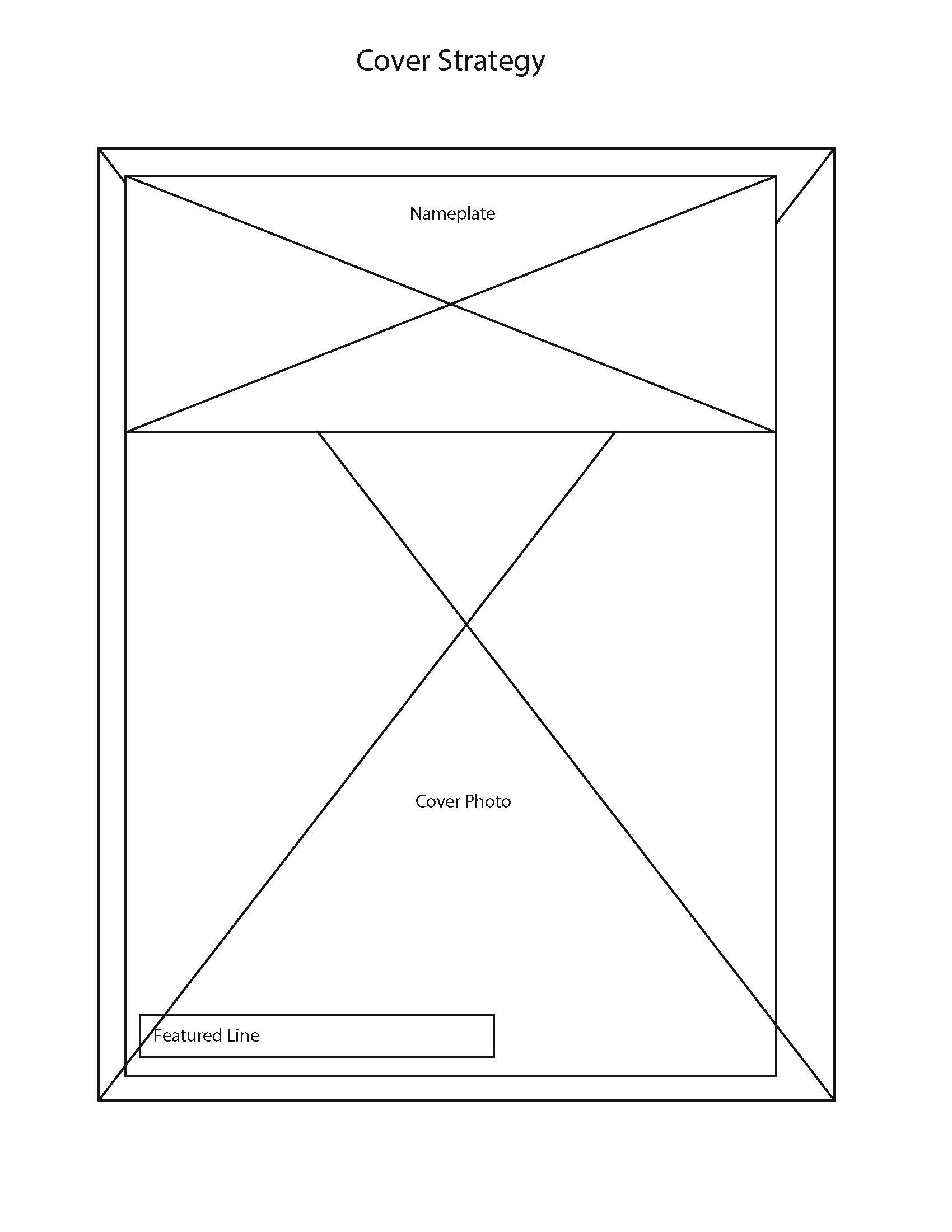
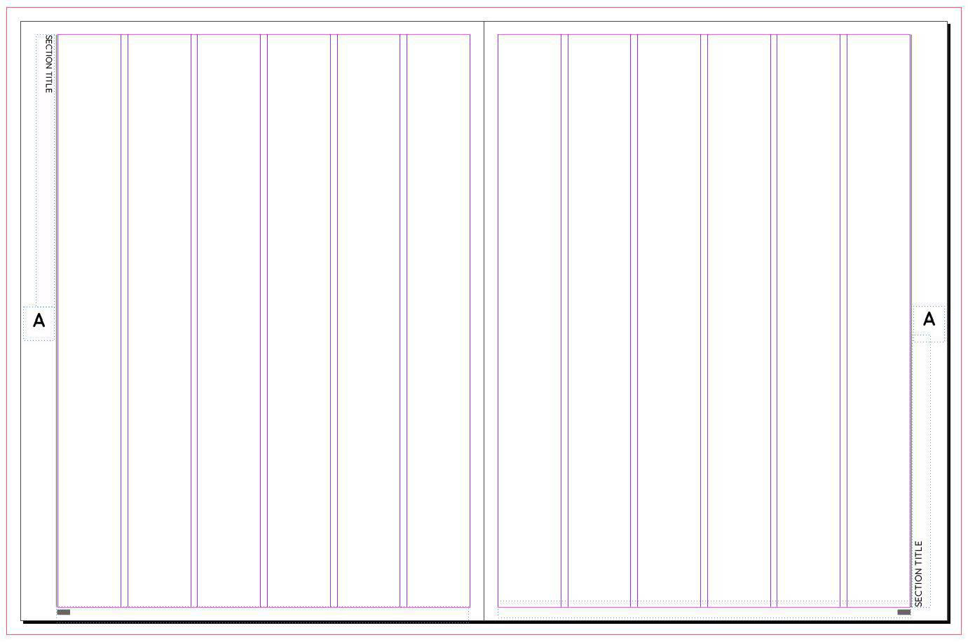
After, the cover strategy and grid & master page were digitally drafted. Both these assets are used to display how the magazine layout will be for this issue and future issues to come.