Project Summary:
This projects goal was to redesign an already existing website to be more helpful for the user/ client. While also updating the website and creating a more modernized design.
This projects goal was to redesign an already existing website to be more helpful for the user/ client. While also updating the website and creating a more modernized design.
Program(s) Used:
Adobe XD
Adobe XD
Type:
Web Design
Web Design
PROCESS
Creative Brief
Client: Pleasure and Pain Ink
PROJECT | purpose and opportunity
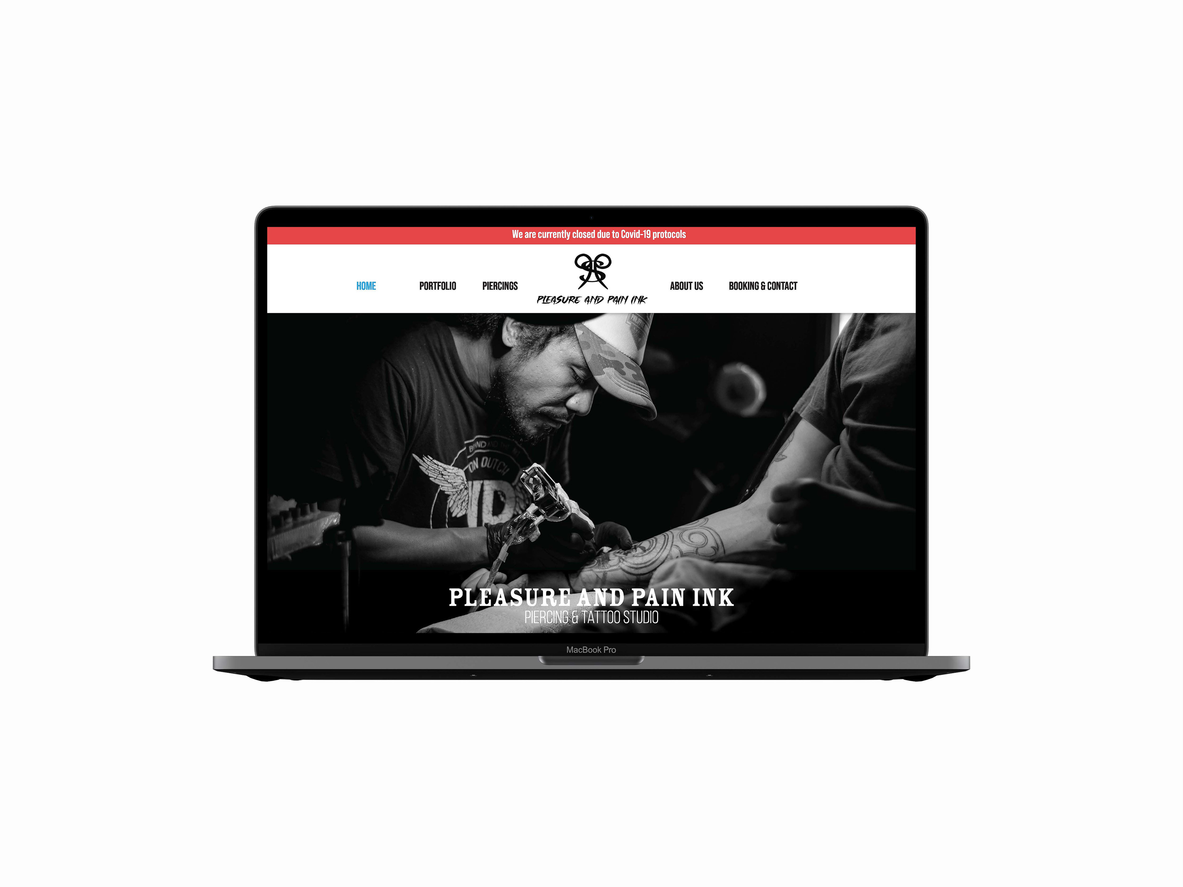
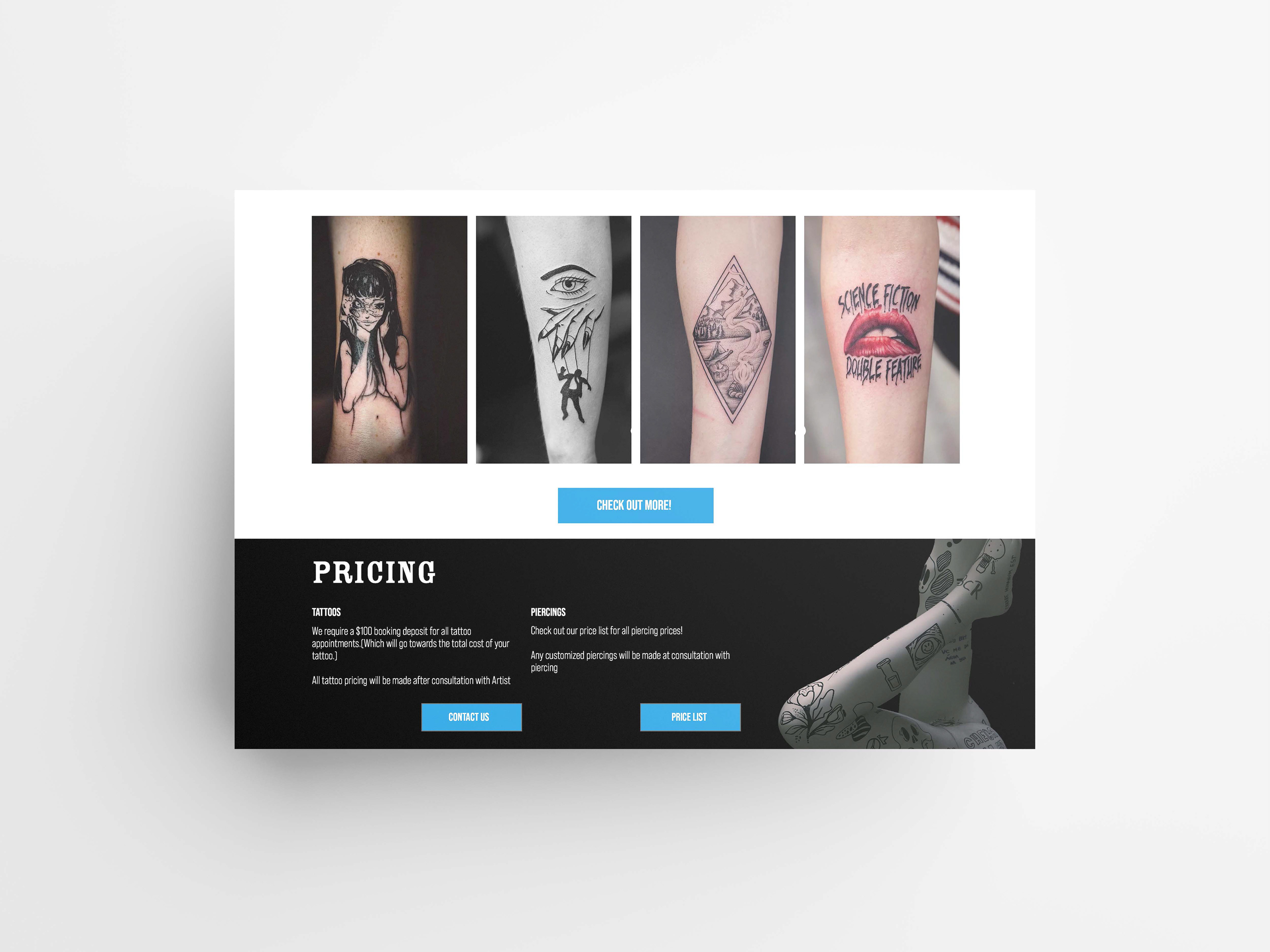
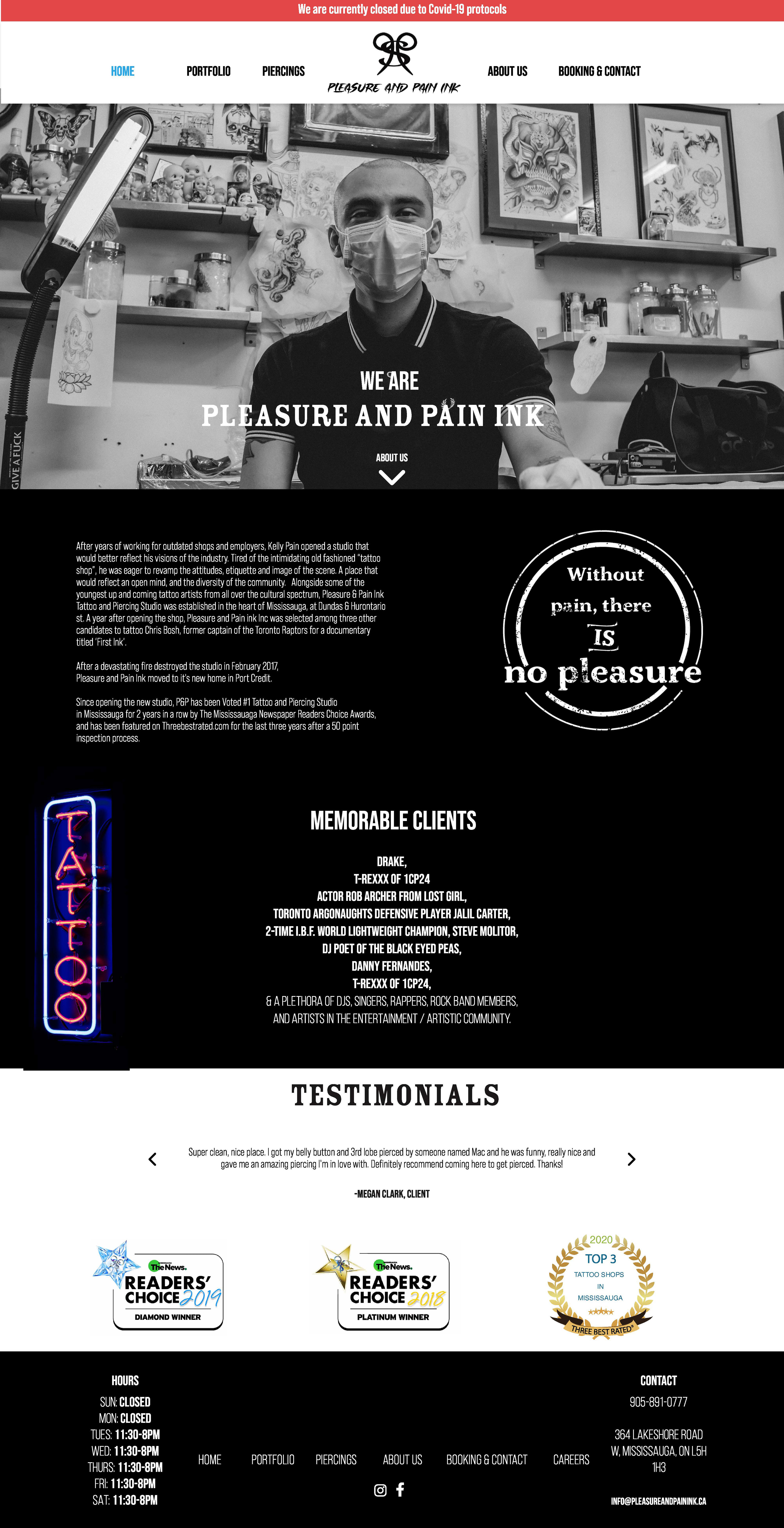
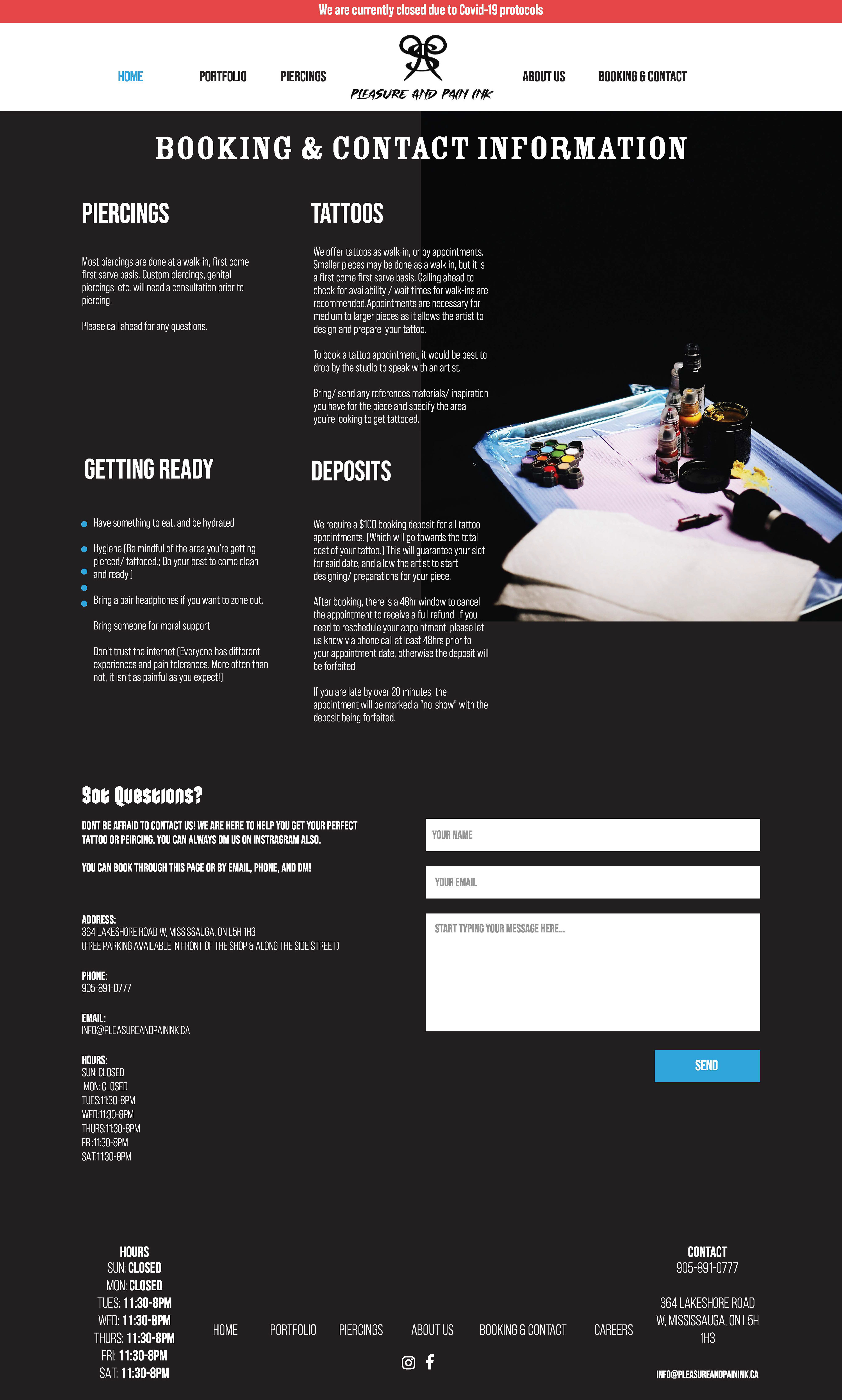
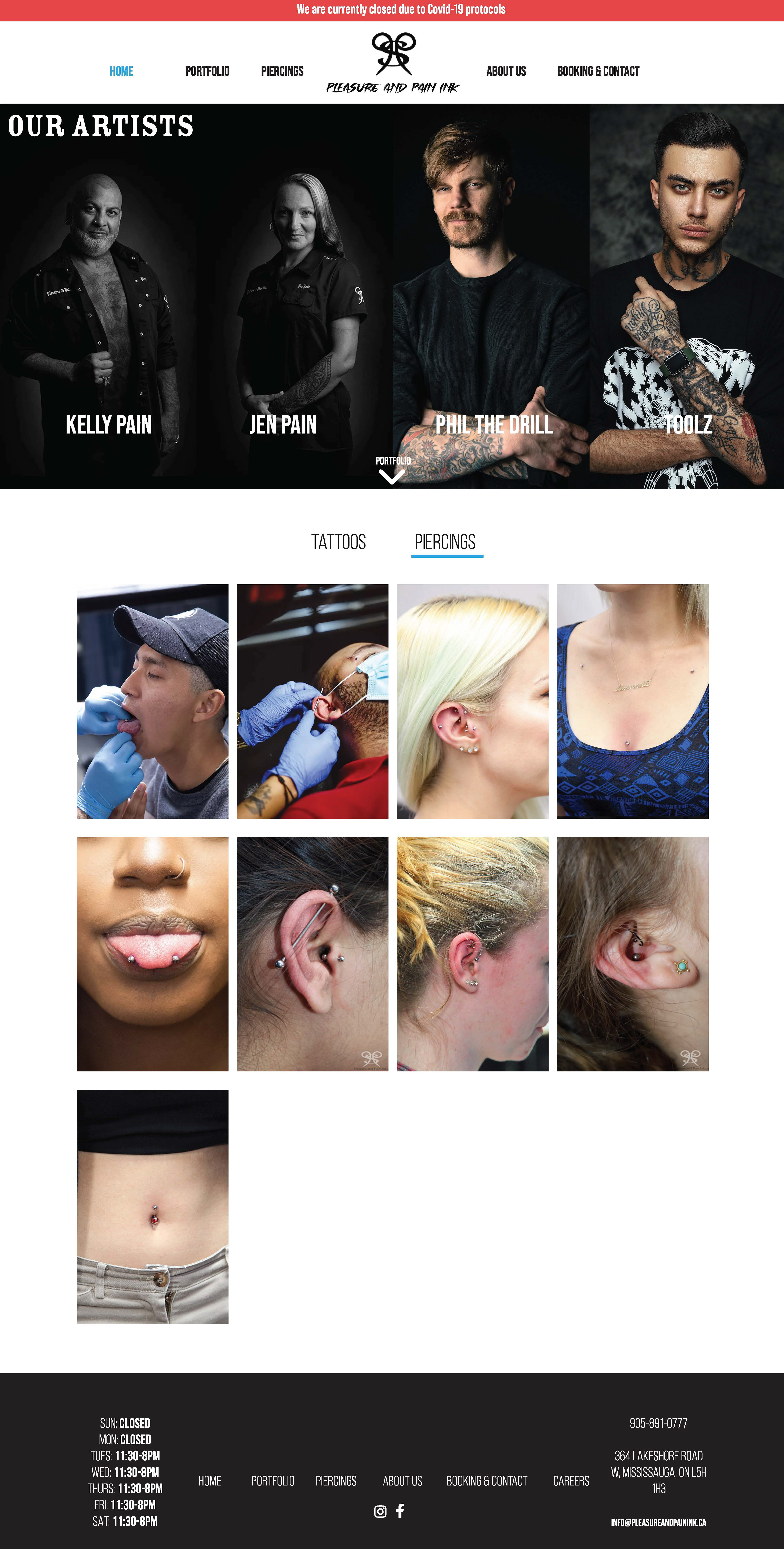
This project is for a tattoo and piercing studio called Pleasure and Pain Ink. I will be re-designing their current website to update the layout and navigation system to enhance the experience of the user. The projects outcome will be 5 desktop pages, which will include a Home, Portfolio, Piercings, About, and Booking & Contact Page.
OBJECTIVE | what does the project work to achieve?
The goal of this project is to create a better website to showcase Pleasure and Pain Ink in the best light. Our objective is to create 5 desktop pages that are easy to navigate and send the message of creative, edgy, and trustworthy.
TARGET AUDIENCE | who are we trying to reach?
The target audience for this website re-design is 18-28 years old. Young adults tend to be the main client base for piercing and tattoo studios, so this website should really attract that age group.
ATTITUDE & MESSAGE | style and importance
Since this website has a young adult audience, the website should feel fresh but also reflect Pleasure and Pain Ink. Their creative, edgy, and most importantly trustworthy style, since these are all important aspects when choosing a place to get a tattoo or piercing.
DELIVERABLES & FORMAT | describe key pieces to be produced
-Xd Prototype Link
-Xd file
-PDF of static design
SCHEDULE | projected timeline, important dates, deadlines, etc.
Week 1: Sketching and Moodboard
Week 2: High Fidelity Wireframes
Week 3: Feedback
Week 4: Final Design
Moodboard & Style Guide
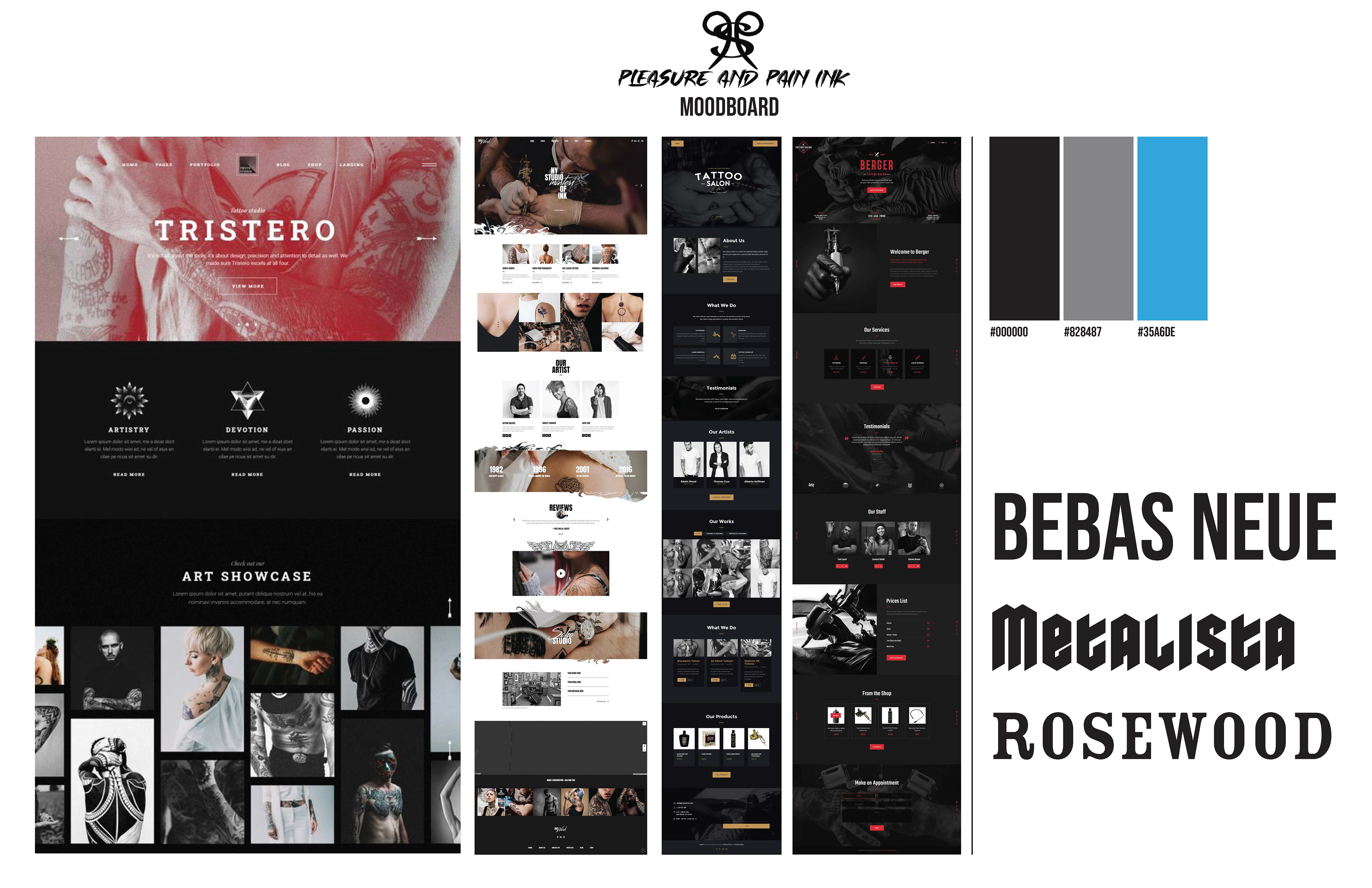
After writing out a creative brief and figuring out my initial and overall goals for this project, I can start visualizing this project through moodboarding and style guides. Moodboarding gives me a good idea of how I want the design to look but can also be used to show the client if I am styling in the right direction. This moodboard shows the design choices of edgy and punk. I've chosen a simple colour palette of black, grey and a shade of bright blue that i've taken from their current website.
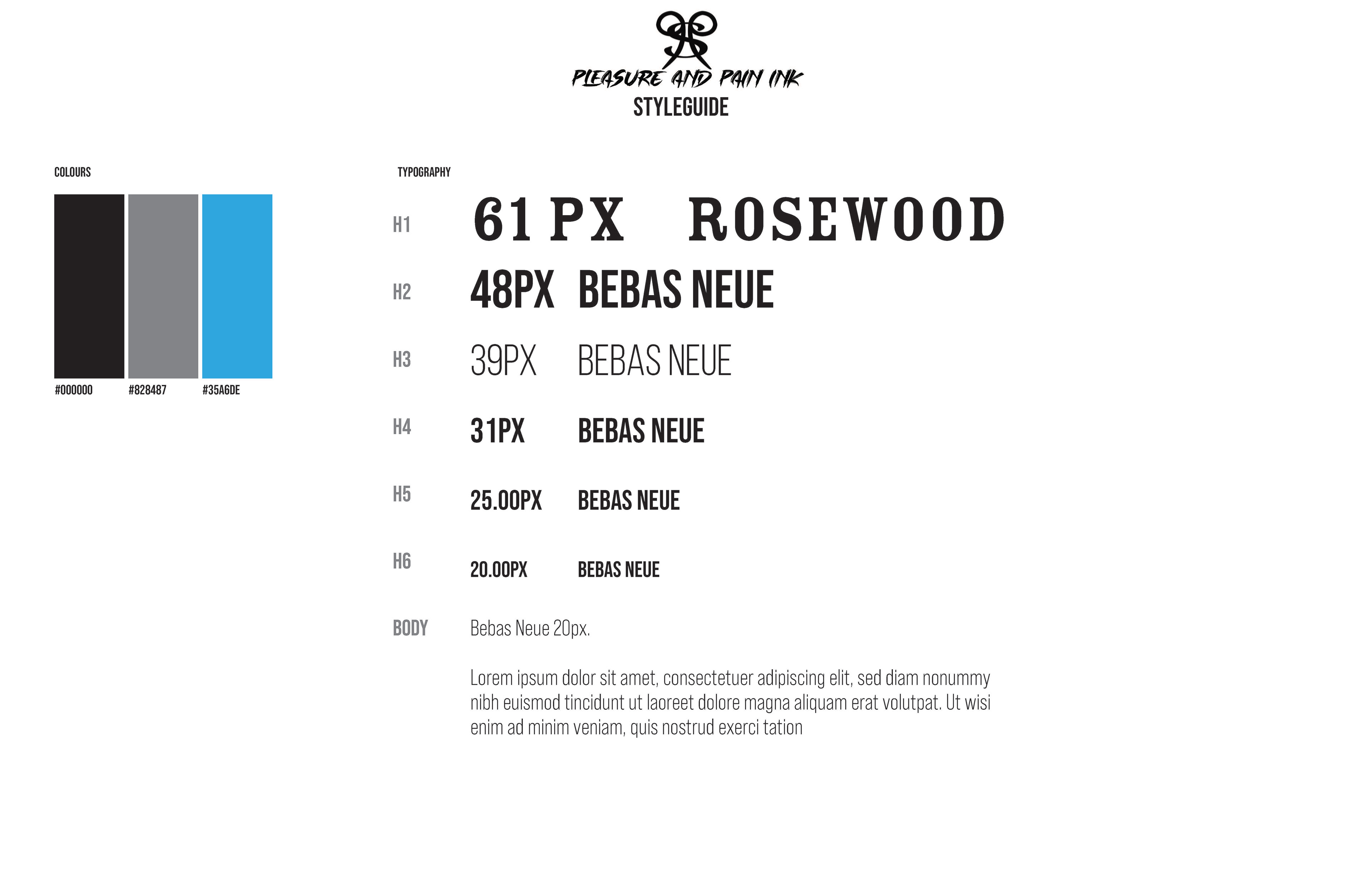
I can then move to the website style guide which is a guide for me to follow when designing so every page can have consistent colours and typography. This style guide also helps web developers instil proper text sizing to ensure a user can easily read and travel through the site.
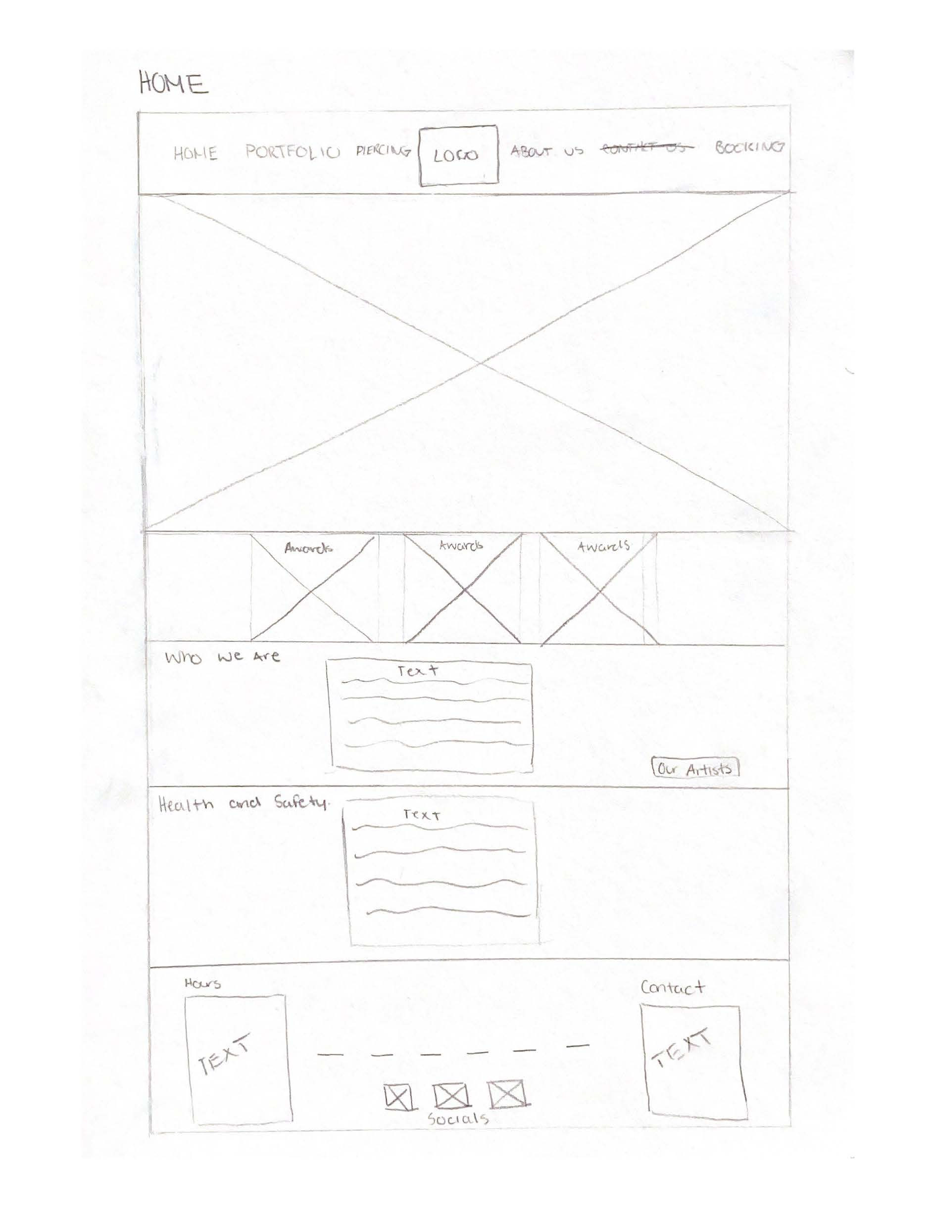
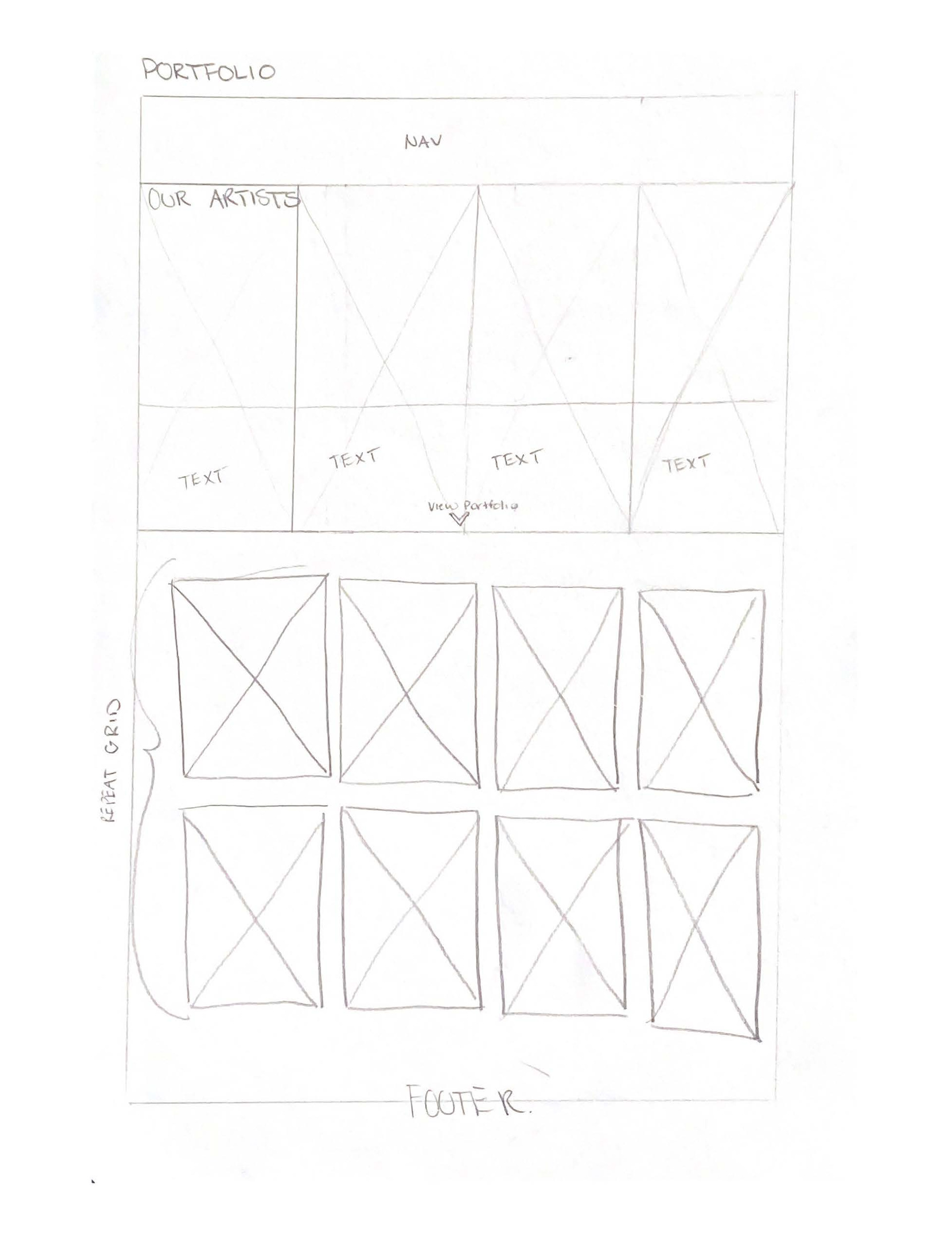
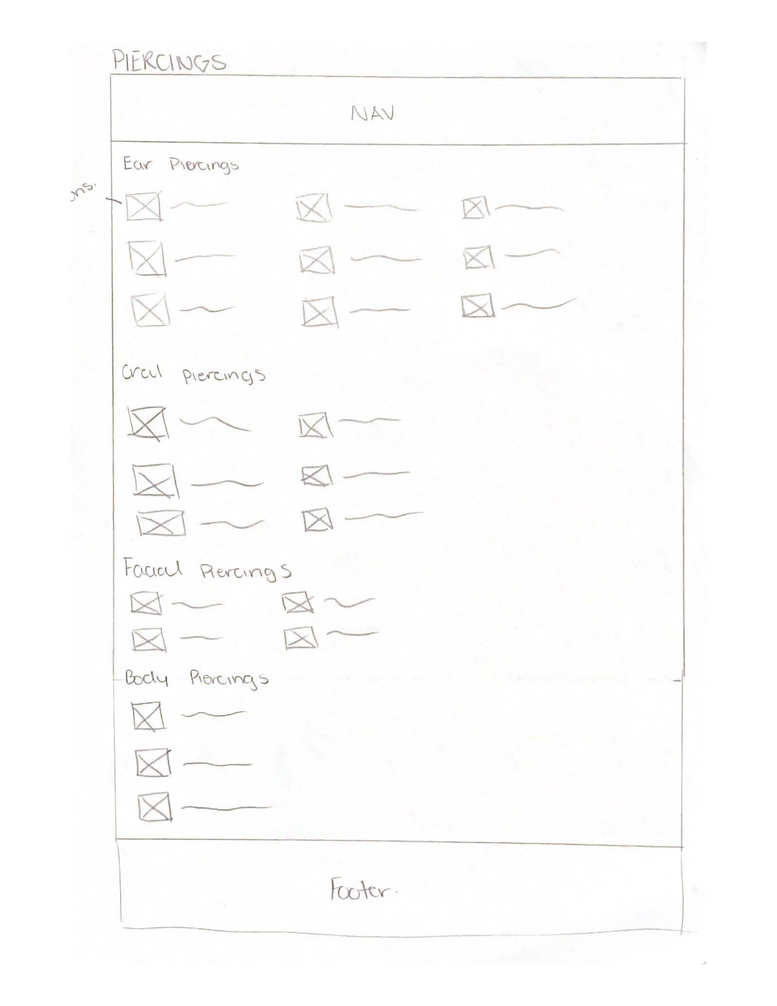
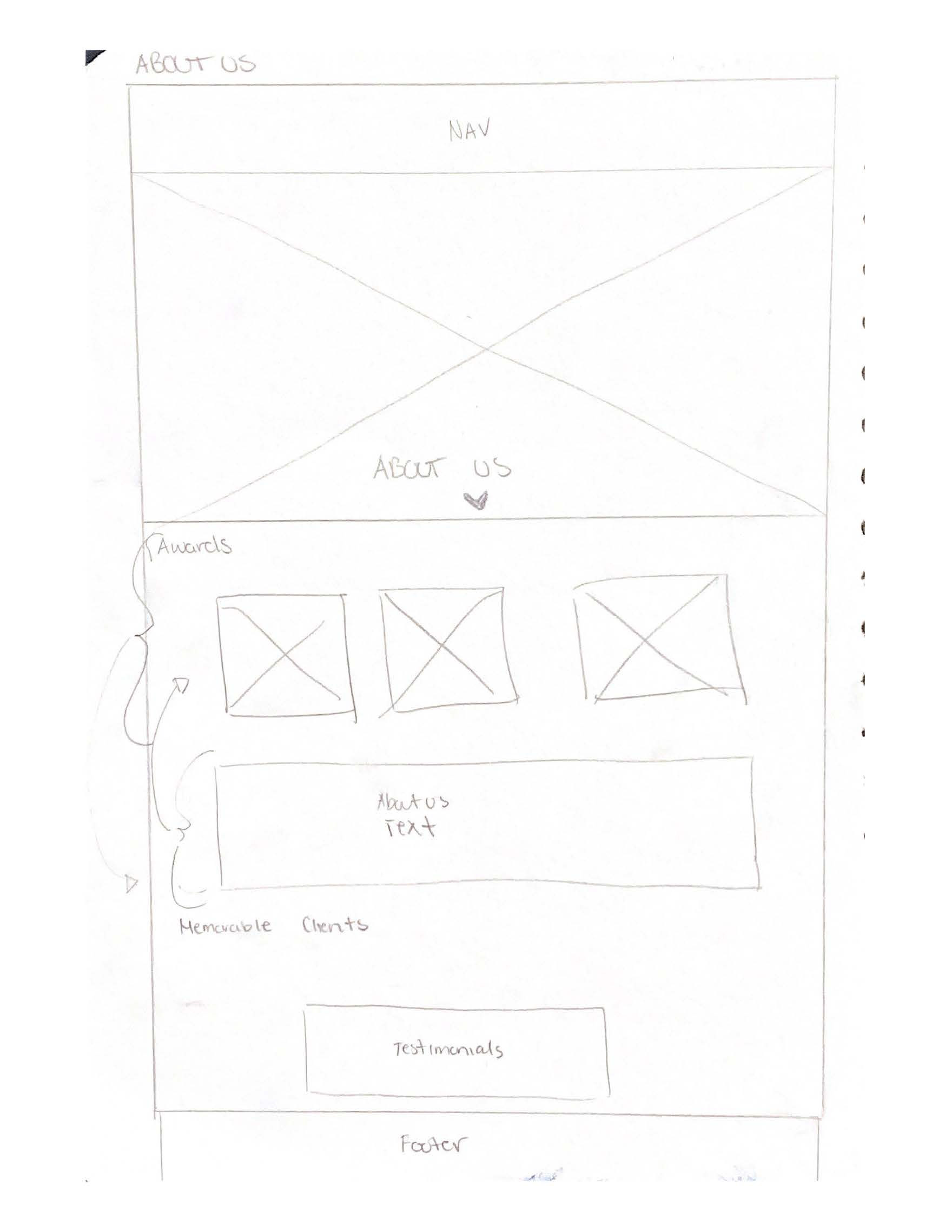
Sketches
Initial sketching helps to provide a rough vision of how i'd like to layout the content of each page. My sketches are not set in stone and only help in the beginning processes as once I start designing on XD some things may not make sense or may not work.
For these sketches, I roughly created sections where I thought images and text would fit and flow best. I sketched out how i'd like the navigation menu to look, any large headers, and some different ways to put blocks of content together. I tried to keep a consistent design using these blocks.
WEBSITE DESIGN
PROJECT FEEDBACK
PROFESSOR FEEDBACK
Zoom Meeting
◦ For the Home page display a bit from every page. For example, a bit from the portfolio, about, Artists etc
◦ Add testimonials
◦ Use fake images for artists so that its all consistent imagery
◦ Make sure the typography hierarchy is consistent, make character styles to keep track
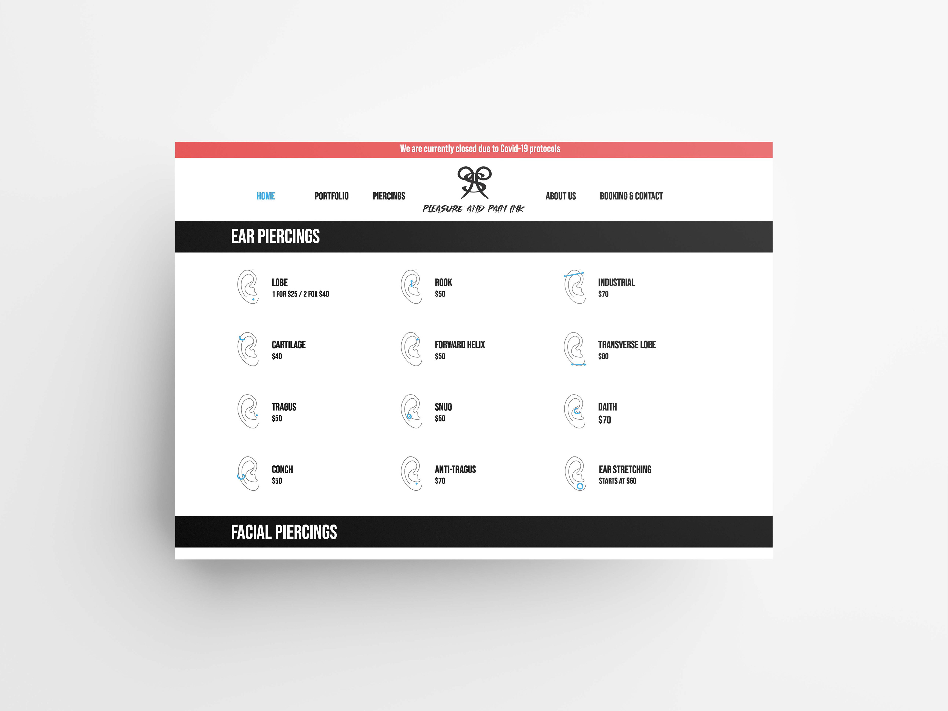
◦ For piercing icons change the colour or stroke weight of the ear to allow for better contrast with the blue.
Reflection
As I designed the rest of the website redesign after this, I took into account to add a bit of every page to the home page, allowing to access any page while scrolling. I added testimonials as I thought it would be a good idea to create a trust between new client and studio. I tried to incorporate consistent photos, although it was still difficult to find photos that looked like they were taken by the same photographer. I created a consistent type scale and added it to the character styles while also changing the stroke of the icons to a grey and thinning out the stroke for better contrast.
PEER FEEDBACK
Victoria Foschia • 04/27/2021 03:52 PM
I really like the amount of effort you put into this re-design, I think you portrayed the brand better than the original website - originally the design is all over the place with hours and awards on strange places all over on the site. I like how your site has a large hero image on the landing page, it definitely looks more clean and welcoming to search through. On the booking and contact page i’d advise you to move the hours near the top and maybe break up the information a bit more into sections as you did on other pages with the use of white space.
Reflection
I agree that I laid out the content differently in the booking & contact information page. I think moving up the hours to the top is good idea, so maybe pushing up the contact information to the top will be more helpful to the user.
Lucas Markovic • 04/28/2021 05:10 PM
Hi Illayna, I really like your re-design of the website for this brand. I like what you did for your landing page making the image the hero for it. Overall, the re-design of this website is clean and has a modern look to it.
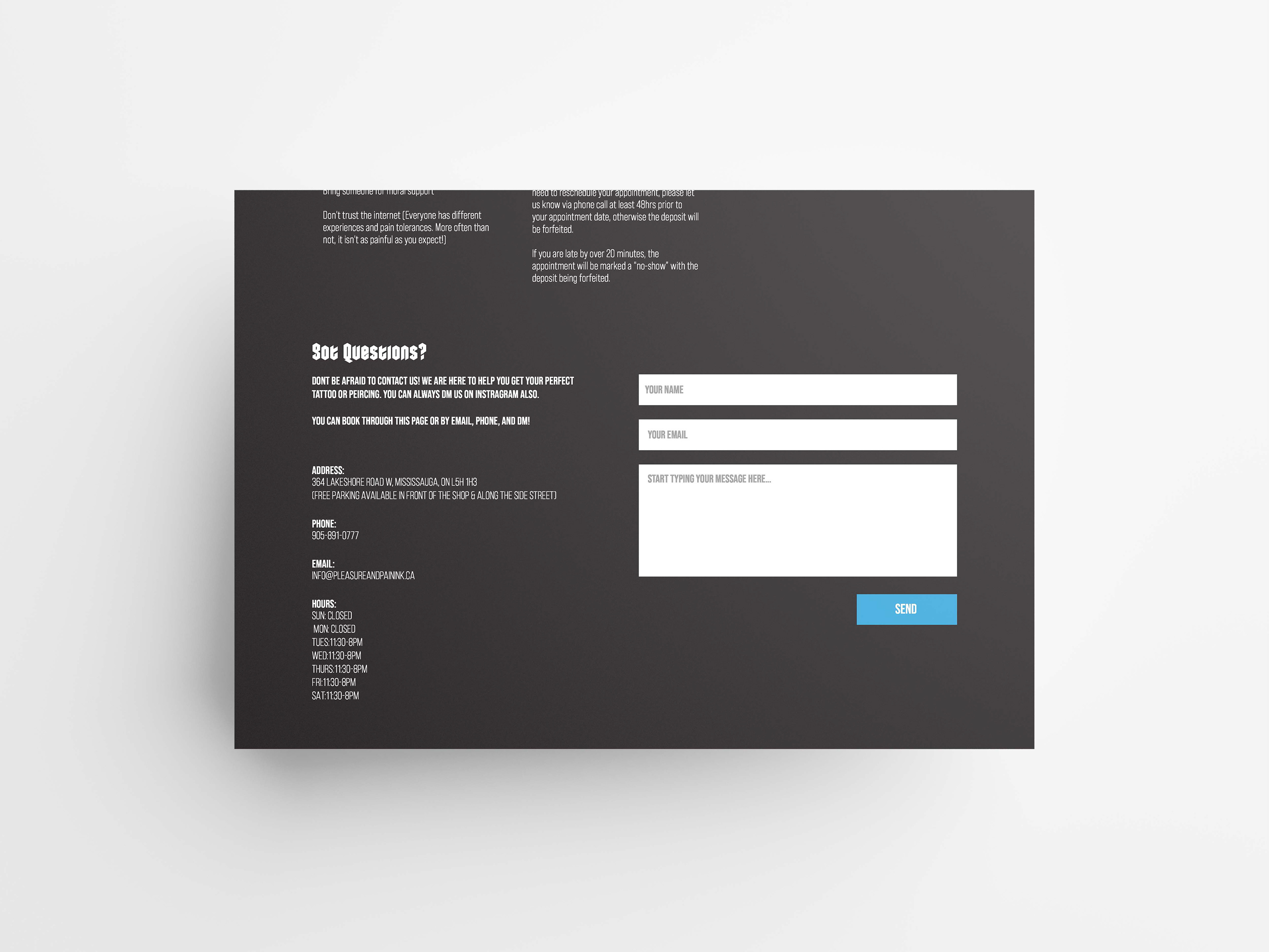
The first thing that I can say is that you need to space some of the information and images out. Because to me there a little bit too close together. Another thing that I can say for the piercings page is that you should add a box to them. One more thing that I can say is to use the white space to your advantage.
Overall, interesting design.
Reflection
I am unsure of which images and text are too close together, but I will look it over and change as needed. Having the box around the icons is a good idea, but the reason there is not a box is because it created an awkward white space between the grids.
Antonette Reginio • 04/29/2021 12:53 AM
Hi Illayna! I love the modern approach to this project! It makes sense since you want the tattoos to pop and stand out. The layout of the images look clean, content is aligned well and hierarchy is definitely achieved.
I would just watch out for the thin icon outlines for the piercings page. I would go a little bit thicker and the colour marker locations of the piercings to be darker (for better visibility).
Overall Awesome well!
Reflection
I did change the colour to create better contrast, although i might’ve made the grey a bit too light. I will change the stroke colour to be darker and change the piercing colour for better contrast again.
Robert MacInnis • 04/29/2021 02:29 PM
Hey Illayna. You such a great job on this one! I think it looks so fitting for a tattoo and piercing place. If I had to find things to comment on, then maybe see if some of the smaller body text can be written in regular caps instead of all caps to help with the hierarchy. Additionally, the “Home” button on the nav stays highlighted on every page, but that’s just small things. Great job!
Reflection
The smaller body text in all caps is a heading for body text, although I will make sure that I didn’t mess up the hierarchy and place it somewhere it wasn’t supposed to be. The highlighting problem in the nav as since been fixed.
All Tattoo portfolio images and logo are property of Pleasure and Pain Ink